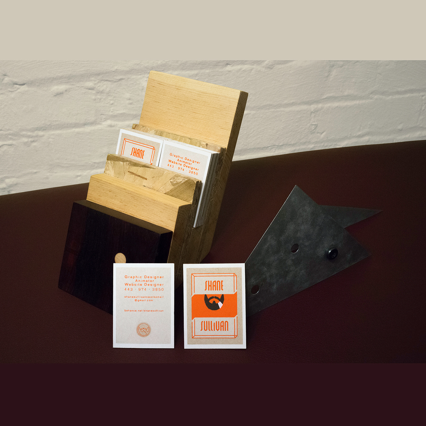
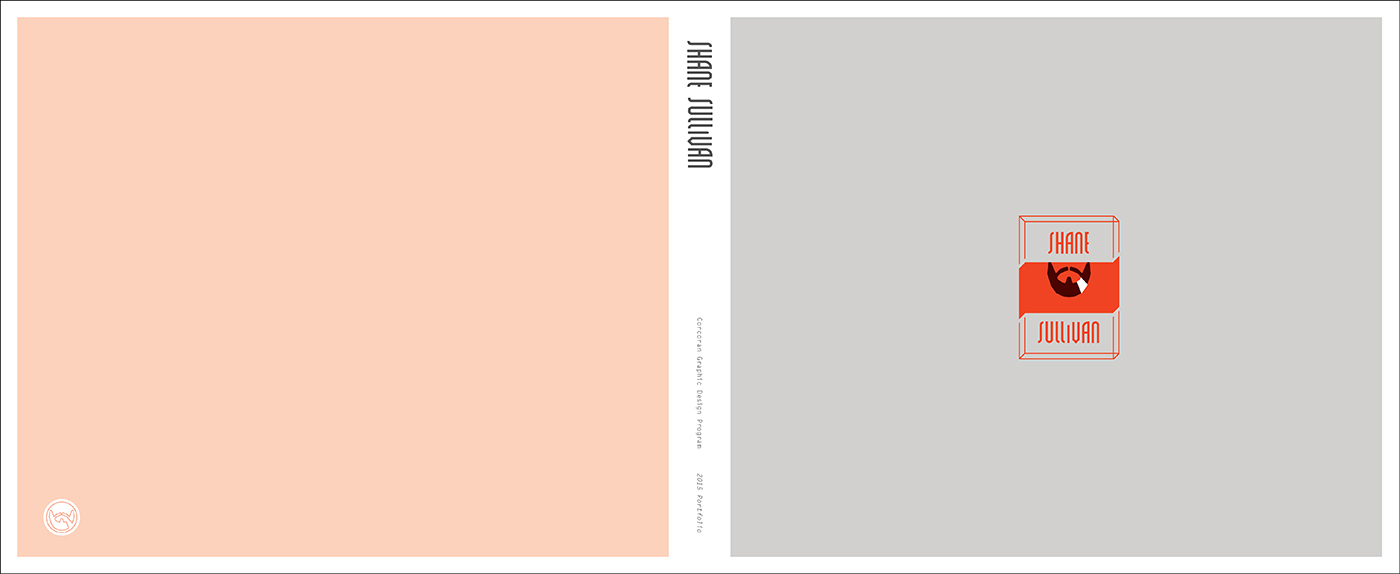
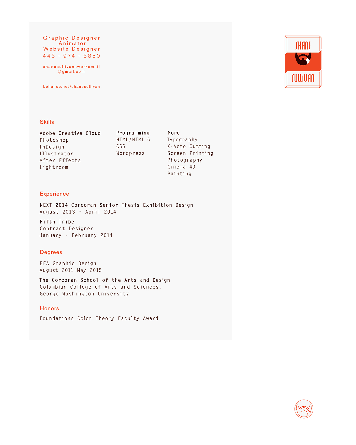
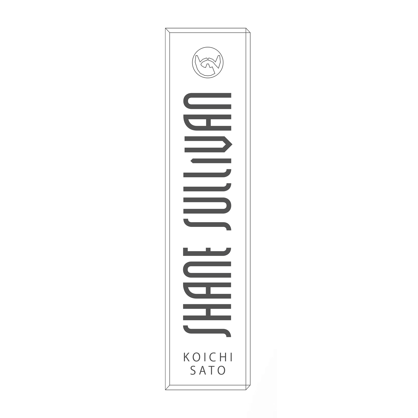
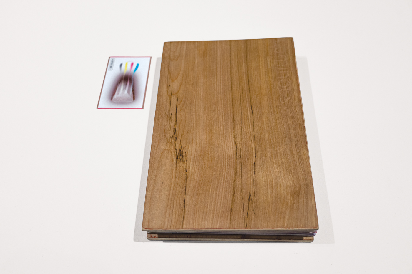
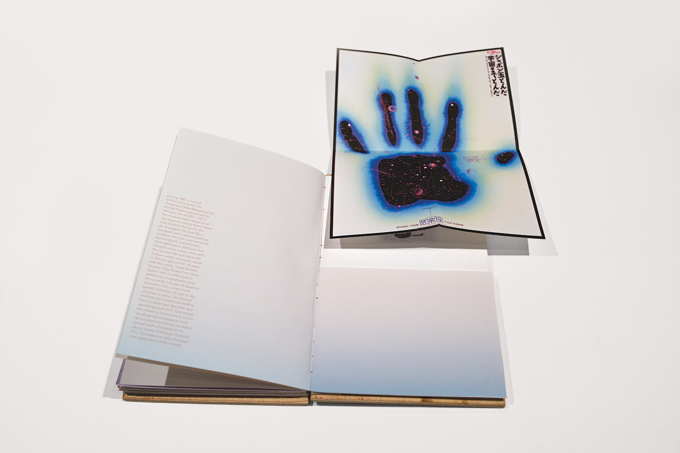
Shane Sullivan Design Studio
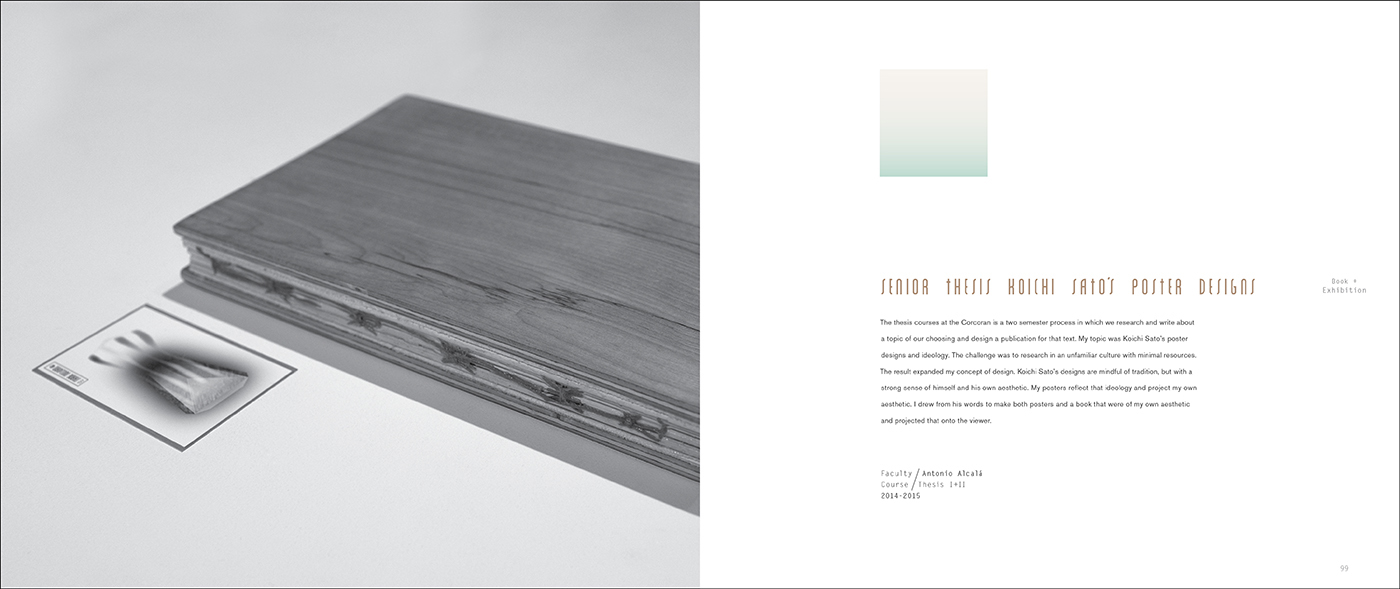
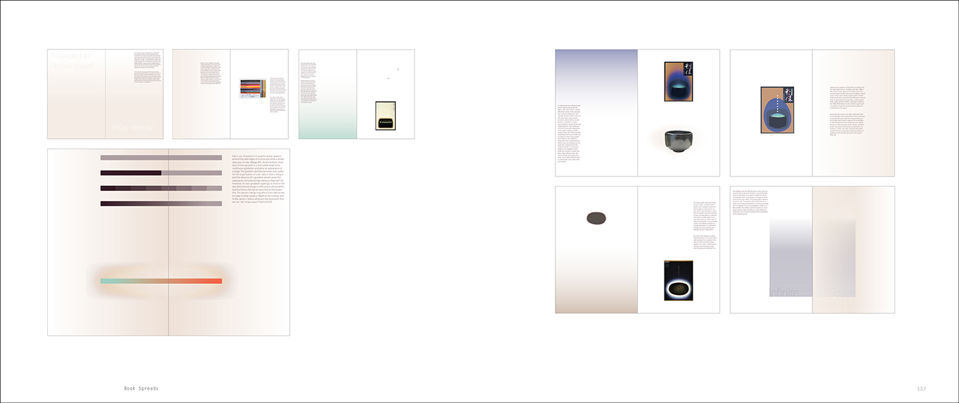
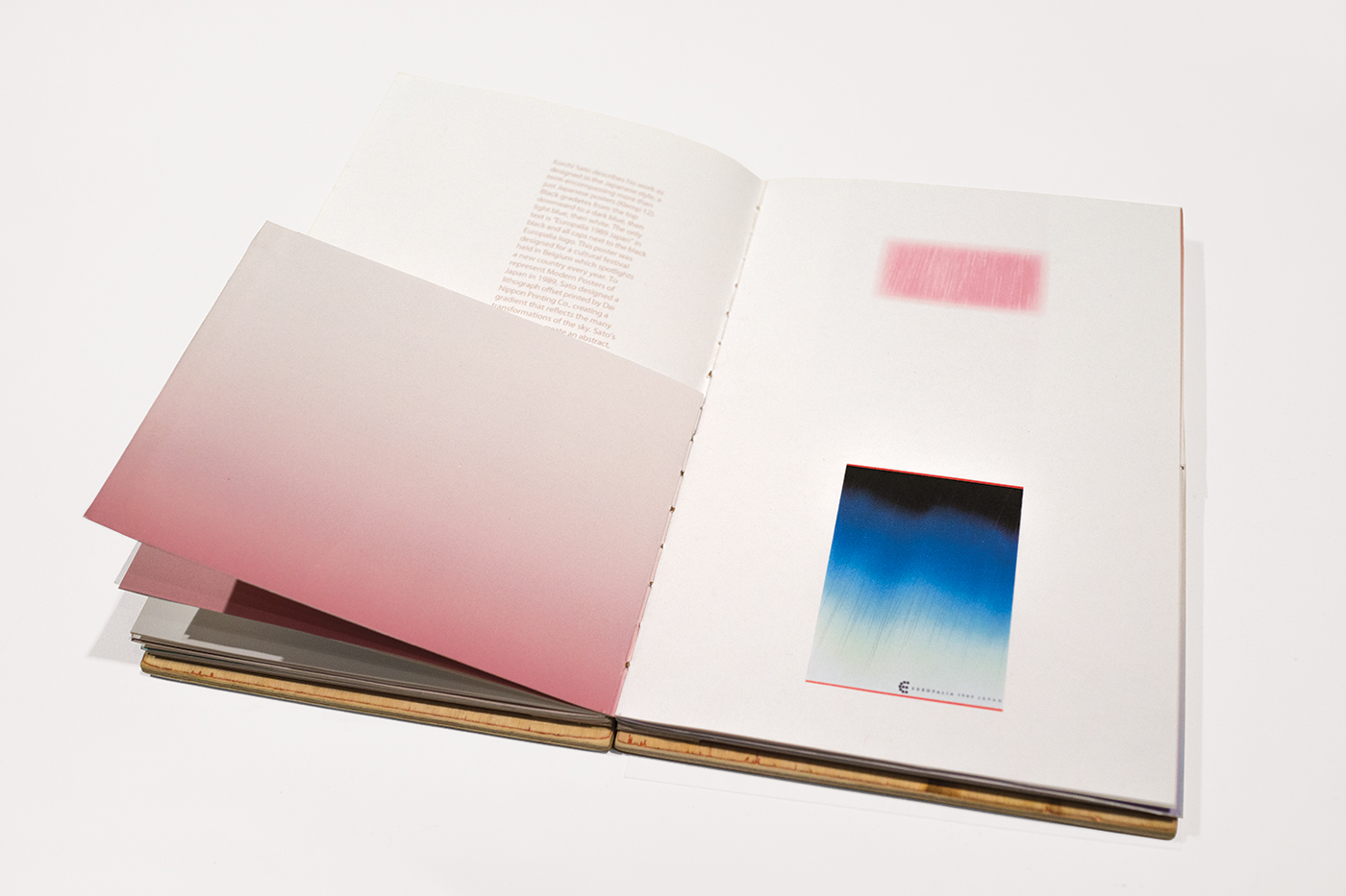
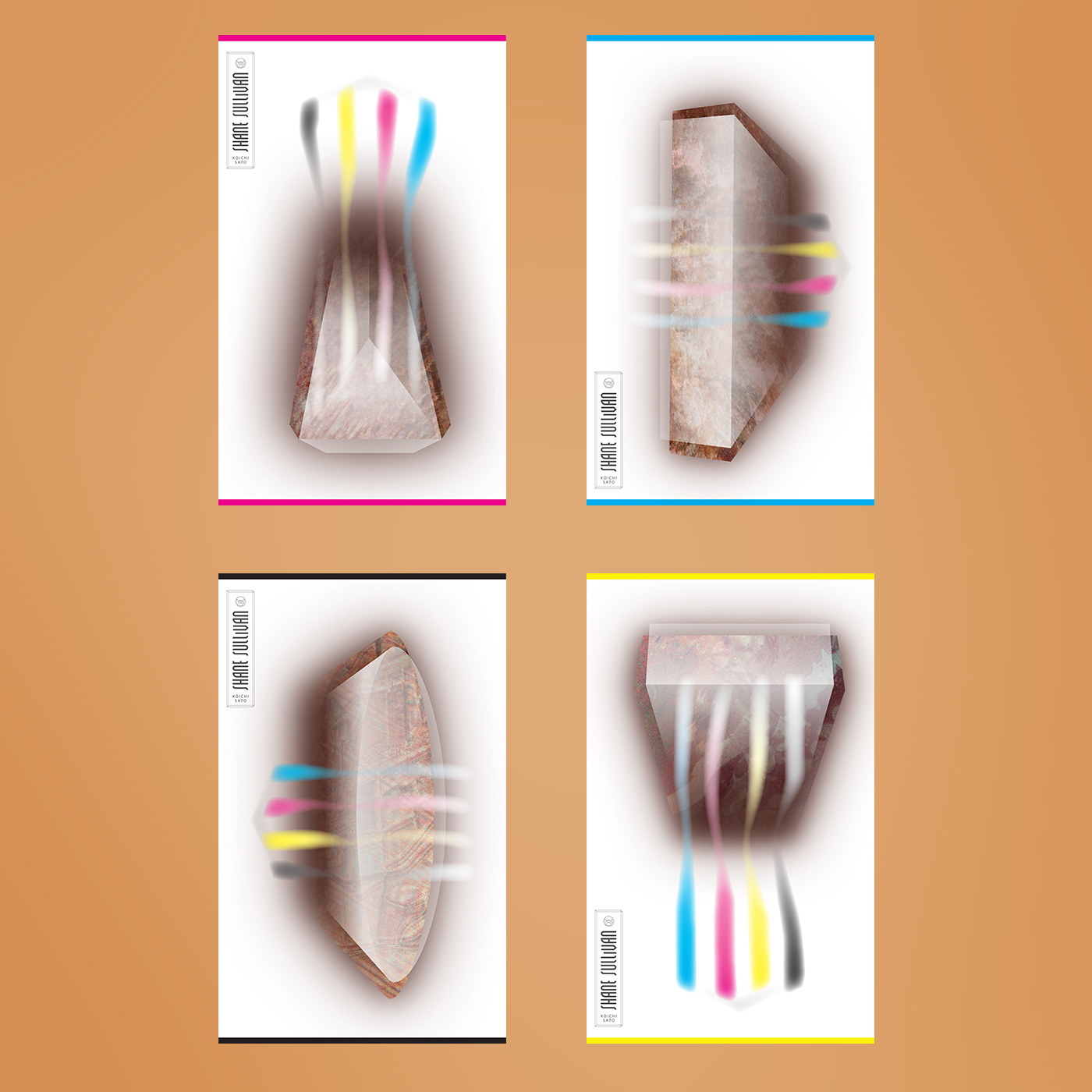
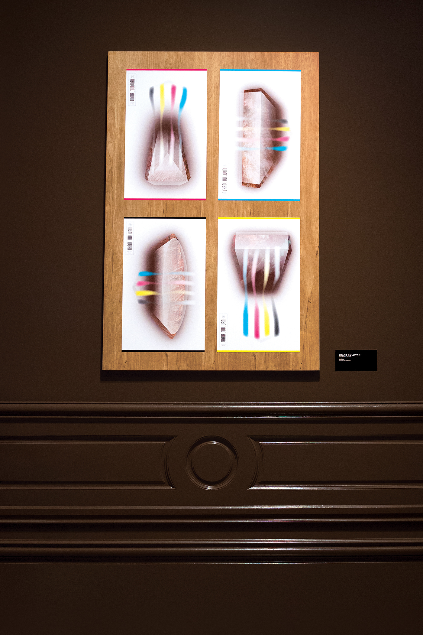
A self-branding project and thesis that focuses around the use of perception and perspective. At every corner of Shane Sullivan's logo is a different view of the cube that encases both name and a beard portrait.(Shane's vitiligo, a disease causing no pigment in the skin, is the white chunk.) Screen printing was used to create business cards while inkjet was used for the resume and other branding material. Shane researched and interviewed Koichi Sato about his poster designs and wrote a paper discussing the work and ideologies. The thesis paper and branding were then designed into a handmade book with a wooden cover. Accompanying the book in the NEXT 2015 Exhibition at Corcoran Museum of Art + Design were four posters that were mounted onto a 40" x 60" wooden panel.