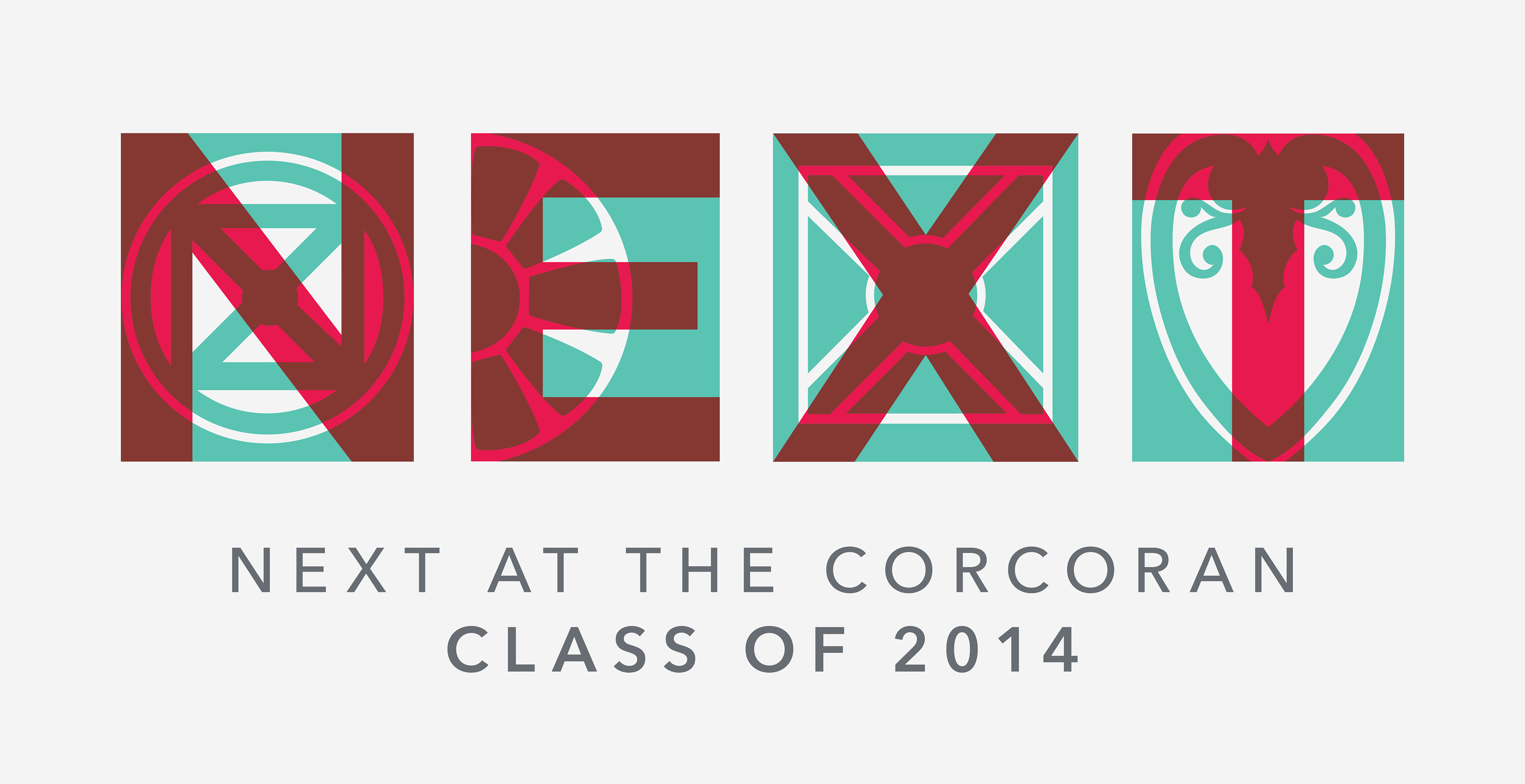
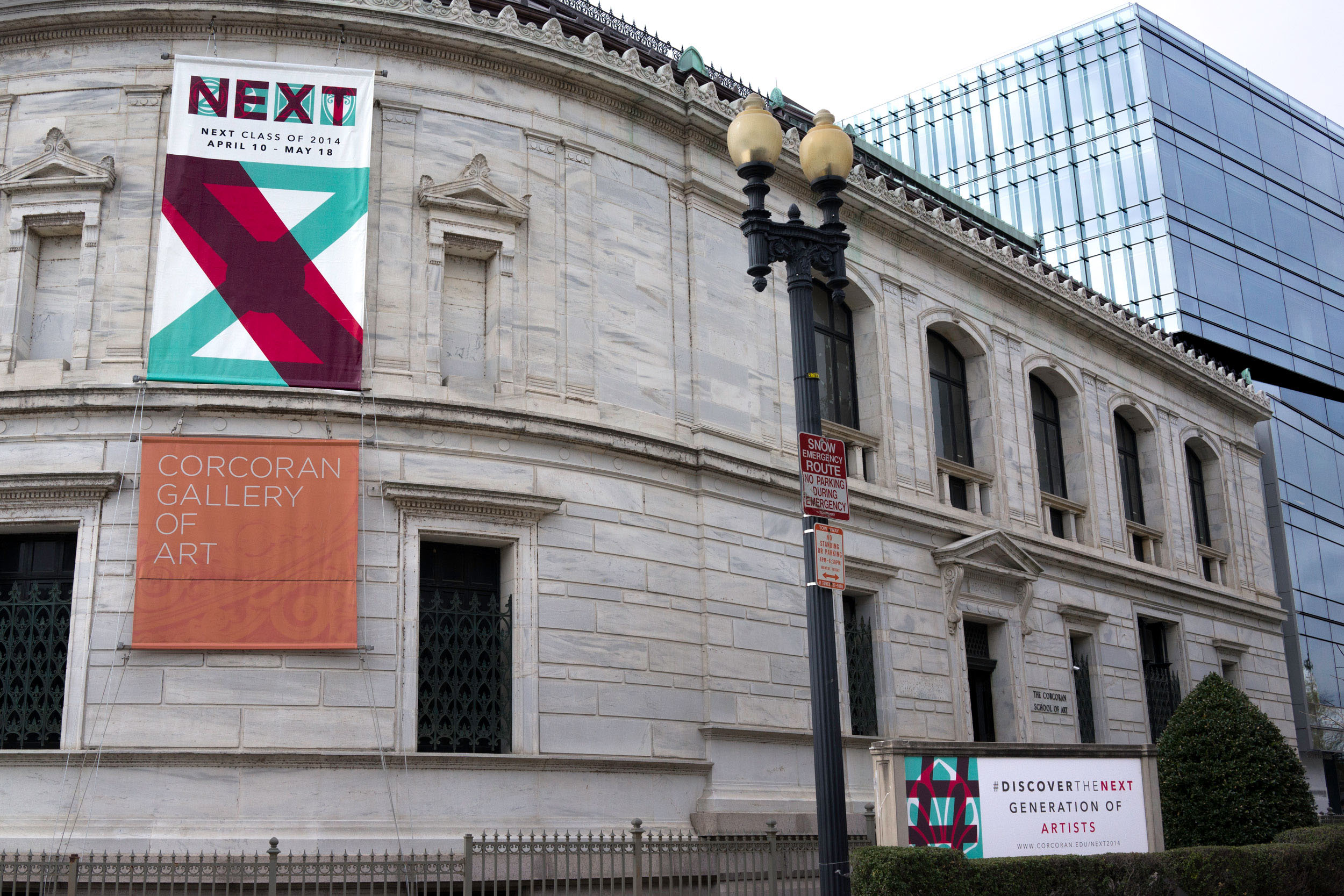
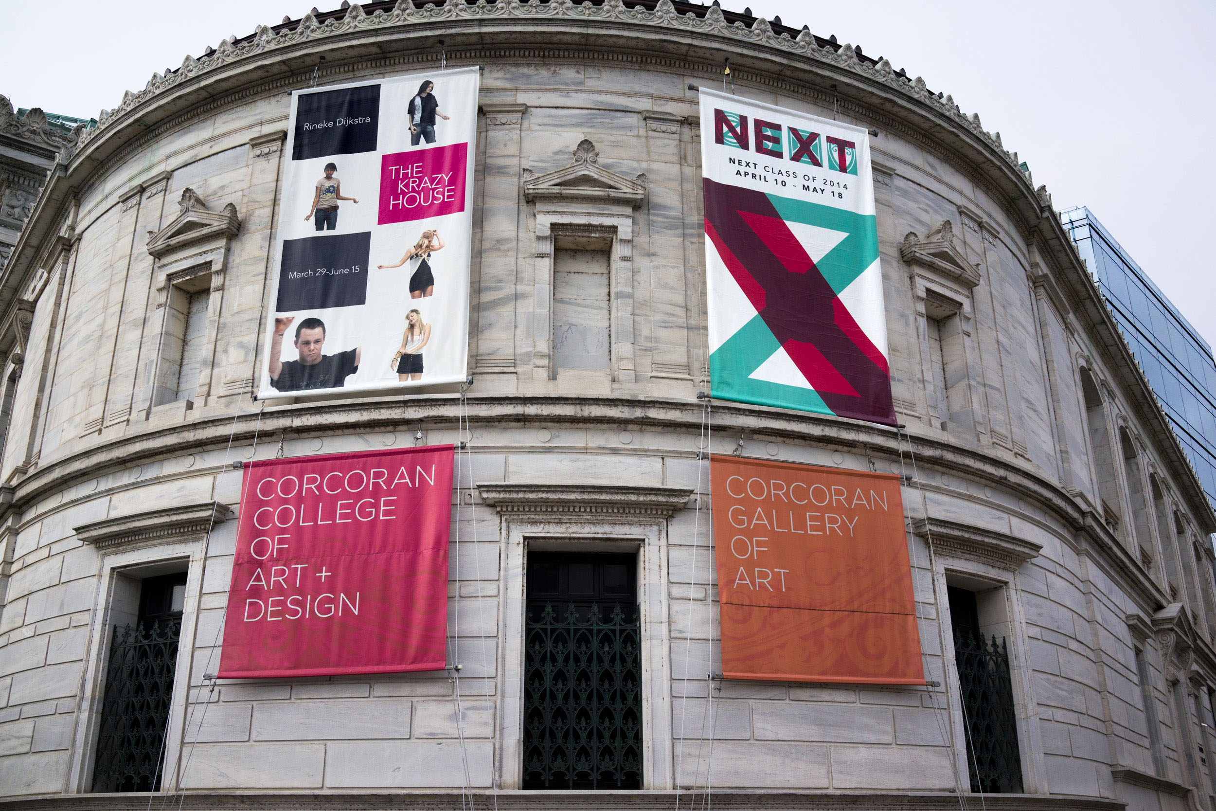
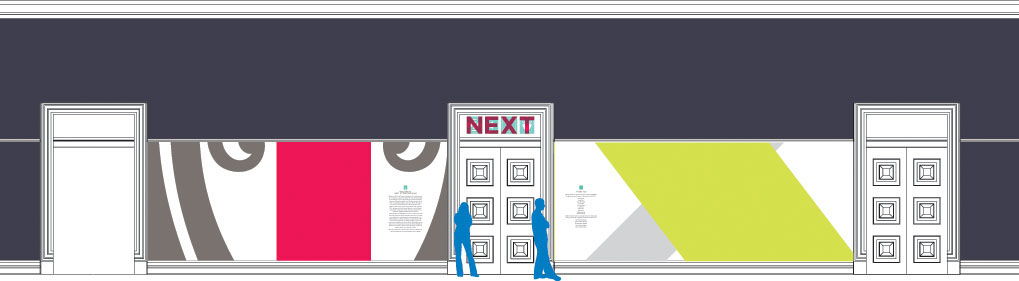
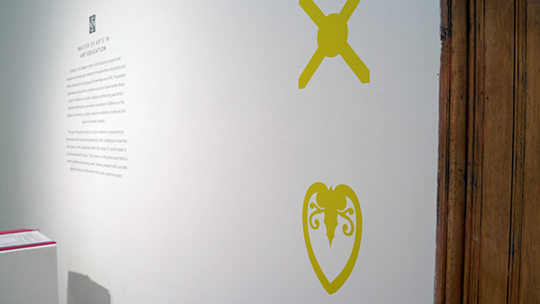
NEXT 2014
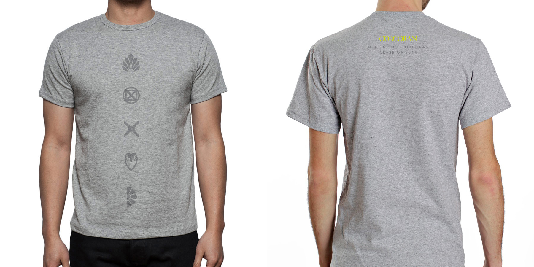
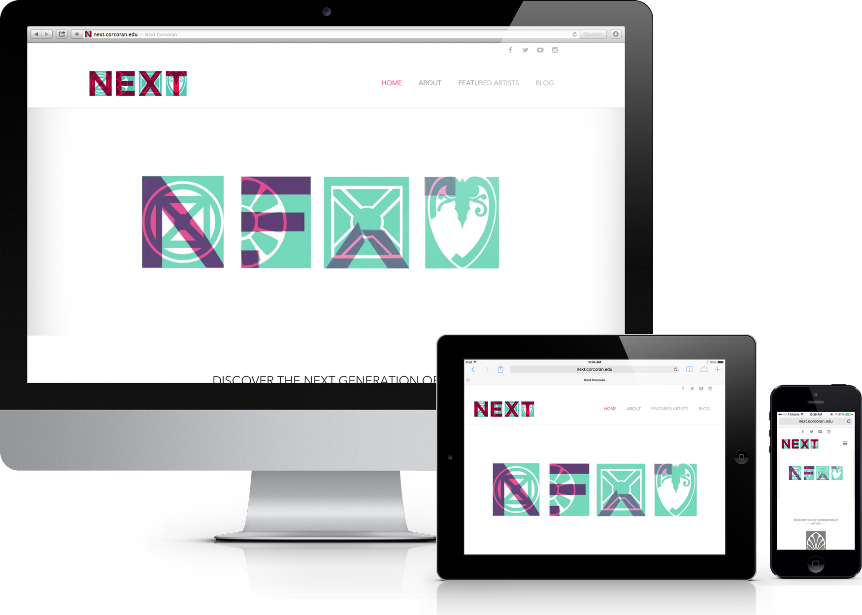
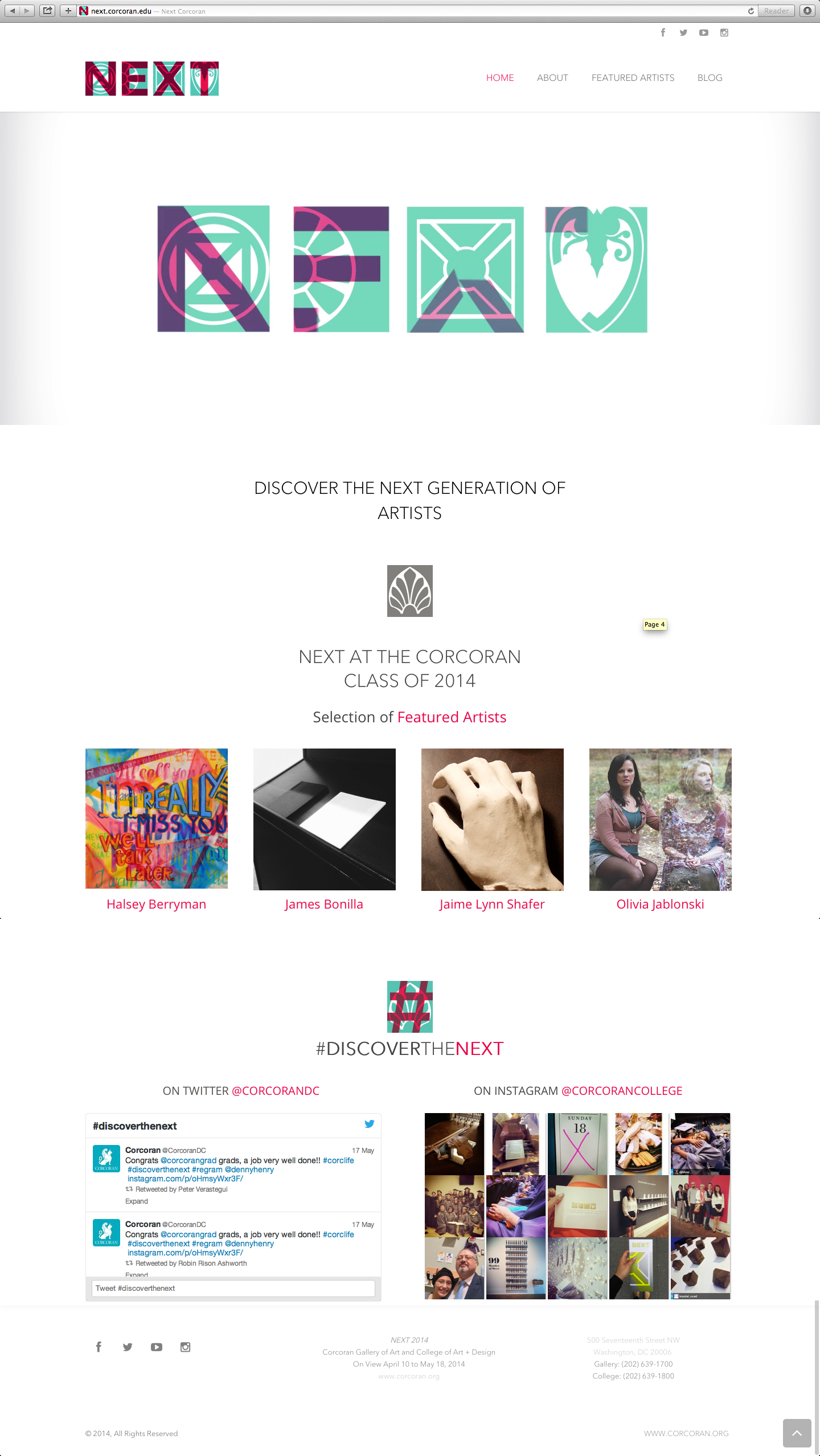
The NEXT 2014 identity is an opportunity to communicate both the transformation and the unity of the Corcoran College and Gallery through an expansion of its community. The Corcoran is comprised of diverse and dynamic individuals who form the solidity and strength of the institution. The purpose of this project is to showcase the thesis work of our graduating students and highlight their creative integrity and potential. With this concept, our goal was to merge the existing classical forms of the Corcoran with a transitional, contemporary edge. This is conveyed through symbols that are based on elements transcribed directly from the structure of the Corcoran. These elements are tangible representations of the past and present states of the Corcoran. When juxtaposed together, these elements fashion a contemporary display of legibility and aesthetic harmony that evokes the classical and timeless nature of the Corcoran.