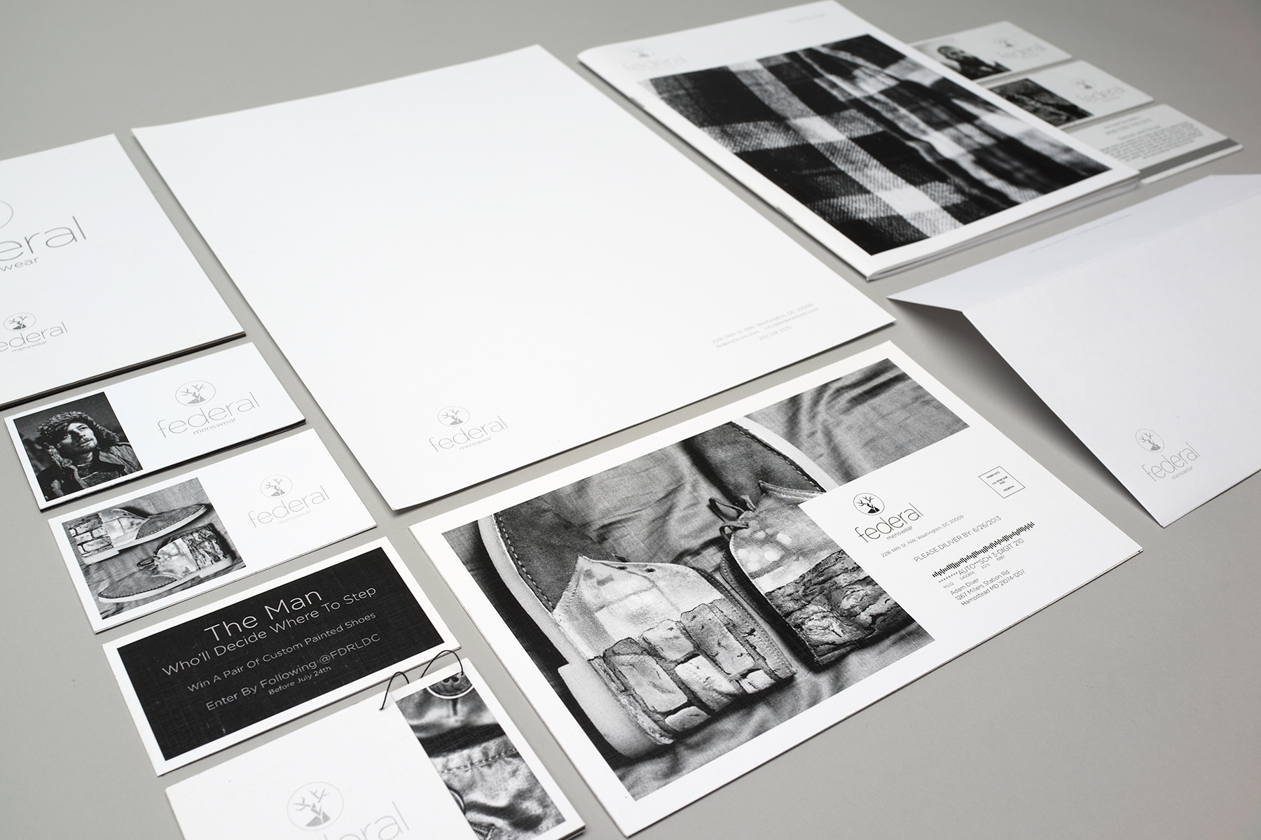
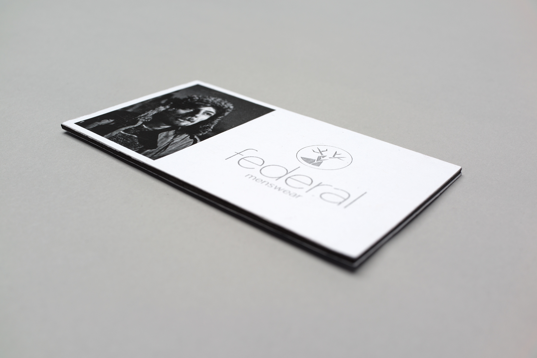
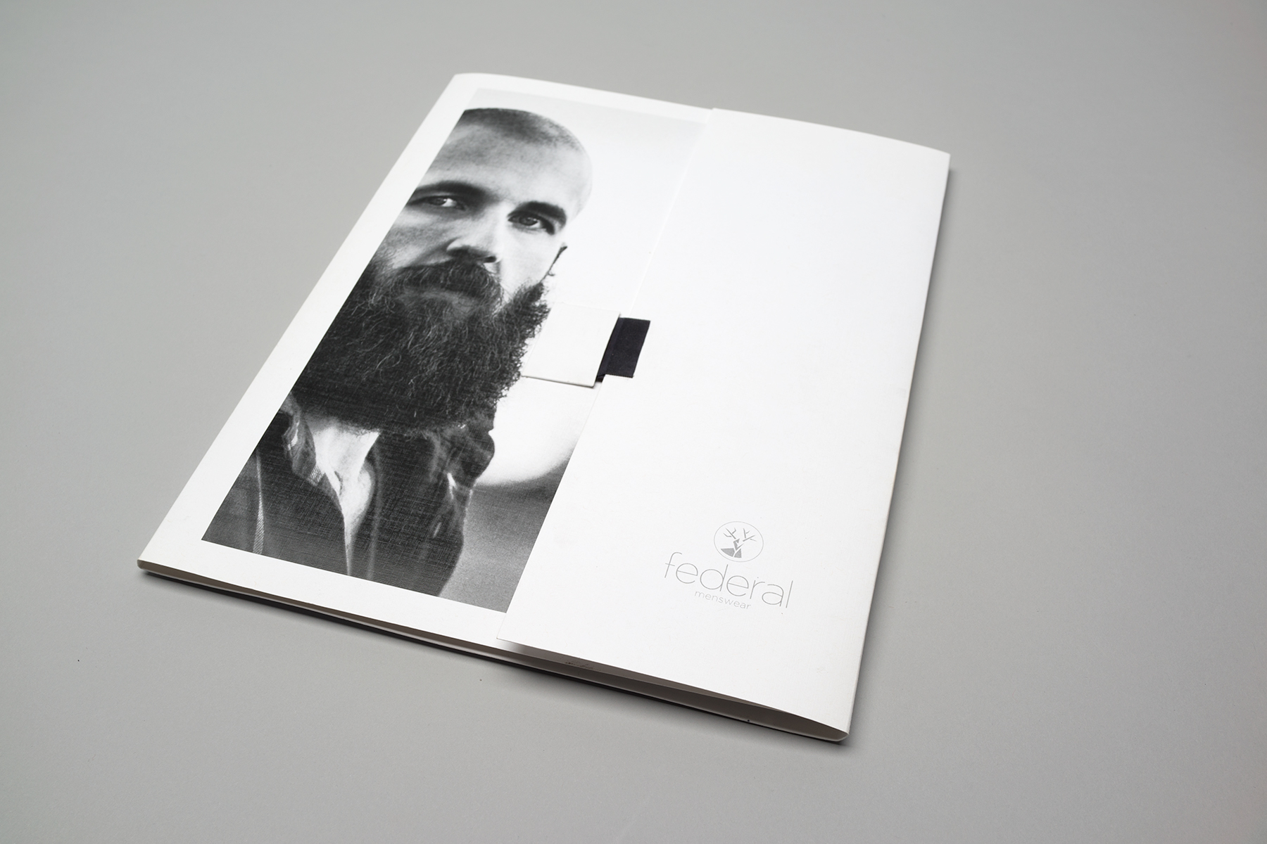
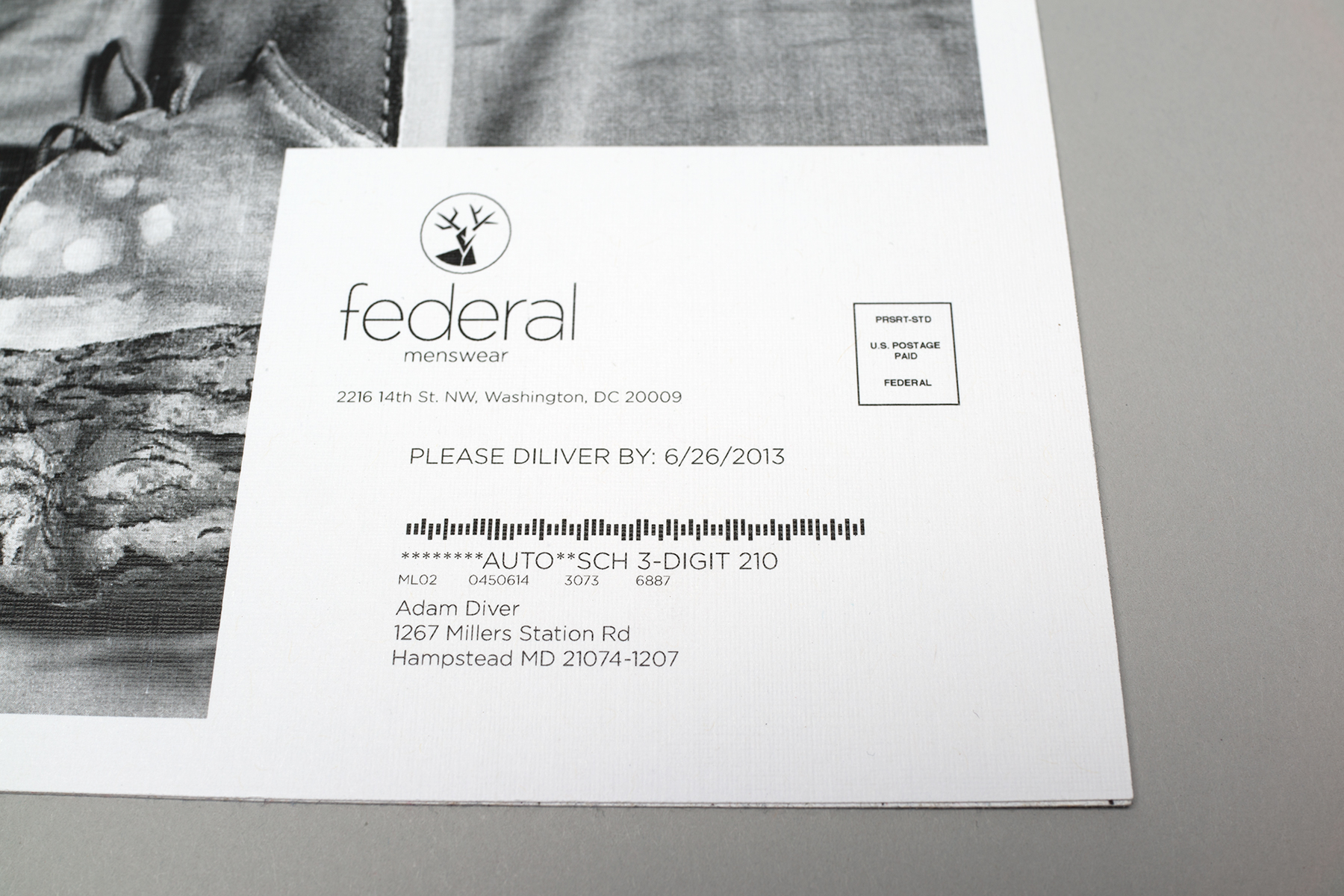
Federal Branding
The Corcoran Sophomore Design class were given the task of re-branding one of three companies. Federal became my chosen brand for the semester. Self shot photography & black graphics compare and contrast the outdoors with the DC area and became the style of the Federal brand. The stag is the center of the logo with sharp abstract points to indicate both elegance and definition. A stag is a male deer which plays literally on the general audience of the store, men. The thin type used for Federal was utilized to contrast the thickness of the circle slightly while keeping a cohesive connection.


Style Guide
Front and Back Covers
25 Inside Pages